【追記:2020/2/10】
本記事はLuxeritasにタイル機能がなかった頃(ver1.12)に記したものです。
現行バージョン(ver3.7)では、テーマ本体にタイルレイアウト機能があります。
(カスタマイズ→グリッドレイアウトから選択できます)
もしその他のテーマをお使いで本記事に紛れ込んでしまった場合は、こちらへお回り下さい。

【以下、過去の記事です】
トップページをタイル表示にしたいよ~。
Pinterestみたいなの?
ああいう高さバラバラなの見づらいからやだ!
タイルの高さ揃えたい!
本記事ではLuxeritasのサイトorブログのトップページ記事リスト(一覧)をプラグイン無しでタイル化し、高さを揃えて表示する方法を紹介します。
また、カテゴリ別アーカイブにも対応しています。
そしてコピペでOKです。
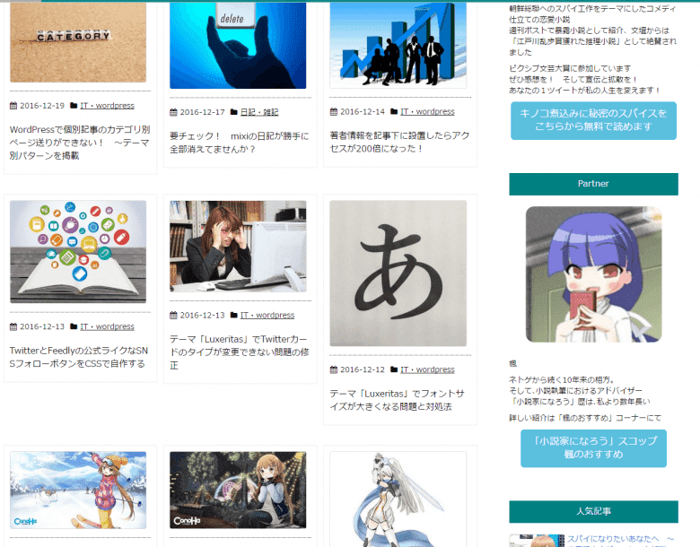
タイル化した見本 ~Bootstrapがあれば簡単にできます
一般にWordPressテーマでタイル化するとなれば、色々と難儀するポイントが多くて四苦八苦します。
特に高さを揃える。
色々見て回っていると、タイルの高さを揃えたいという声を結構見かけました。
Pinterestみたいなのは写真メインかつ大量表示だといいんですけど、文章メインな普通のブログだと見づらさの方が先に立つかなって思います。
実際に超人気のテーマSimplicity2ですと「タイル 高さを揃える Simplicity」で検索すると結構記事が出てきます。
……もちろんBootstrapを扱えればですけどね。
初めてだけにかなり苦労しました。
でも、できました!
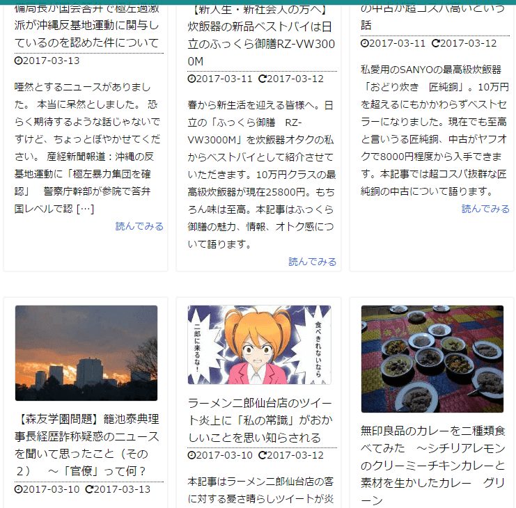
パターン1:抜粋なし 高さだけ揃えてカードの高さは揃えない
パターン2:抜粋を入れてカードの大きさも高さに合わせる
最初に断り事
本記事のベースとなるverは1.12(16.12.19リリース)となります。
ウィジェットには対応していませんので御承知おきください。
私はウィジェットを設置するつもりないので対応する予定もありません。
また、
見よう見まねでやっただけですので、間違っていれば、あるいはよりよい書き方があれば、遠慮無く御指摘ください。
タイル化手順
事前準備
子テーマなどの用意
子テーマをインストールしていない場合は、公式ページ からダウンロードしてインストールしてください。
また、親テーマのlist.phpを子テーマに入れます。
編集は、子テーマのlist.phpで行います。
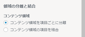
カスタマイザーを設定する
カスタマイズ→カラム操作→領域の分離と結合→コンテンツ領域→「コンテンツ領域を項目ごとに分離」にチェック。
サイドバーは300pxにしています。
ファイル編集の前に ~ざっくりしたBootstrapの説明
row:行の操作。
container:rowをまとめる。
本記事の例におけるレイアウトはタイル3枚並びの1パターンのみ。
rowは高さを揃える役割くらいに捉えていただいて結構です。
html
list.phpの編集
<div id="list" itemscope itemtype="http://schema.org/SearchResultsPage">
<?php
}
else {
?>
<div id="list">
↓
<div id="list" class="container-fluid" itemscope itemtype="http://schema.org/SearchResultsPage">
<?php
}
else {
?>
<div id="list" class="container-fluid">
<div class="row list-card row-eq-height">一覧を囲んでいる#listにBootstrapのcontainer-fluid属性を付与します。
container-fluidはcontainerより柔軟なレイアウトができます。
次いで、同じくBootstrapのrowで囲みます。
row-eq-heightはタイルの高さを揃えるために必要となる属性です。
<div class="toc<?php echo $luxe['content_discrete'] === 'discrete' ? ' grid ' : ' '; ?>clearfix">↓
<div class="toc<?php echo $luxe['content_discrete'] === 'discrete' ? ' col-sm-6 col-md-4 ' : ' '; ?>clearfix">〆は#bottom-areaの上で。
tocがBootstrapのcolにあたる要素ですので属性を付与します。
colに続く英字と数字で、解像度とタイルの列を調整できます。
本記事の例はスマホで1列、タブレットなど(sm)で2列、PC(md)で3列の構成です。
スマホは記述の必要なし。
タブレットは12÷6=2、PCは12÷4=3。
レイアウトを変えたい場合は、この英字と数字を調整してください。
記事出力部分。新たにタイルとなる部分です。
<section>
<h2 class="entry-title" itemprop="headline name"><a href="<?php the_permalink(); ?>" class="entry-link" itemprop="url"><?php the_title(); ?></a></h2>
<?php
 $meta_under = false;
 get_template_part('meta');

// ソースに無駄があるけど、速度的にこっちのが速いので if 分岐多段にした
 if( $luxe['list_view'] === 'excerpt' ) {
 if( !isset( $luxe['sticky_no_excerpt'] ) ) { // sticky_post も含めて全部抜粋で表示する場合
 get_template_part('list-excerpt'); // 抜粋表示
 }
 elseif( is_sticky() === true ) { // sticky_post の場合
 get_template_part('list-content'); // 記事全文表示
 }
 else {
 get_template_part('list-excerpt'); // 抜粋表示
 }
 }
 else {
 get_template_part('list-content'); // 記事全文表示
 }
?>
</div>
<p class="read-more"><?php
 if( isset( $luxe['read_more_text'] ) ) {
?><a href="<?php the_permalink(); ?>" class="read-more-link" itemprop="url"><?php echo ( isset( $luxe['read_more_short_title'] ) ) ? read_more_title_add( $luxe['read_more_text'] ) : $luxe['read_more_text']; // 記事を読むリンク ?></a><?php
 }
?></p>
</section>
次の通り修正します。
<section>
<div class="card">
<figure class="term">
<?php
if( isset( $luxe['thumbnail_visible'] ) ) {
 $post_thumbnail = has_post_thumbnail();
 if( !empty( $post_thumbnail ) ) { // サムネイル

$thumb = 'thumbnail';
 if( $luxe['thumbnail_is_size'] !== 'generate' ) {
 $thumb = $luxe['thumbnail_is_size'];
 }
 elseif( $luxe['thumbnail_width'] > 0 && $luxe['thumbnail_width'] !== 150 ) {
 $thumb = 'thumb' . $luxe['thumbnail_width'] . 'x' . $luxe['thumbnail_height'];
 }
?>
<a href="<?php the_permalink() ?>"><?php the_post_thumbnail( $thumb, array( 'itemprop' => 'image', 'class' => 'img-responsive' ) ); ?></a>
<?php
 }
 elseif( isset( $luxe['noimage_visible'] ) ) {
 $no_img_png = 'no-img.png';
 $no_img_wid = 150;
 $no_img_hgt = 150;

switch( $luxe['thumbnail_is_size'] ) {
 case 'medium':
 case 'large':
 case 'full':
 $no_img_png = 'no-img-300x300.png';
 $no_img_wid = 300;
 $no_img_hgt = 300;
 break;
 case 'generate':
 if( $luxe['thumbnail_width'] >= 150 ) {
 $no_img_png = 'no-img-300x300.png';
 $no_img_wid = $luxe['thumbnail_width'];
 $no_img_hgt = $luxe['thumbnail_height'];
 }
 break;
 default;
 break;
 }
?>
<a href="<?php the_permalink() ?>"><img src="<?php echo TURI; ?>/images/<?php echo $no_img_png; ?>" itemprop="image" class="thumbnail" alt="No Image" title="No Image" width="<?php echo $no_img_wid; ?>" height="<?php echo $no_img_hgt; ?>" /></a>
<?php
 }
}
?>
</figure><!--/.term-->

<?php
 $meta_under = false;
 get_template_part('meta');
?>

<h2 class="entry-title" itemprop="headline name"><a href="<?php the_permalink(); ?>" class="entry-link" itemprop="url"><?php the_title(); ?></a></h2>
</section>
.cardで、サムネイルやタイトルなど、colにいれる要素をまとめます。
出力を、サムネイル→メタ→タイトルの順番に並べ変えます。
「抜粋」と「記事を読む」がないのは、デザインをすっきり見せるため。
単に好みですなので、つけたい場合は残して下さい。
(私も戻すかもしれません)
その場合、if分岐は要らないので、これだけでいいです。
<?php echo get_the_excerpt(); ?>
<a href="<?php the_permalink() ?>">続きを読む</a>
完成
編集したlist.phpは全部まとめるとこんな感じです。
$_is_search = is_search();

if( $_is_search === true ) {
?>
<div id="list" class="container-fluid" itemscope itemtype="http://schema.org/SearchResultsPage">

<?php
}
else {
?>

<div id="list" class="container-fluid">

<div class="row list-card row-eq-height">

<?php
}

global $luxe, $meta_under;

$b_flag = true;
$s_flag = true;

if( $_is_search === true ) {
 if( $luxe['content_discrete'] === 'discrete' ) {
 if( $b_flag === true ) {
 ?><div class="toc<?php echo $luxe['content_discrete'] === 'discrete' ? ' grid ' : ' '; ?>clearfix"><?php
 if( $luxe['breadcrumb_view'] === 'inner' ) get_template_part( 'breadcrumb' );
 thk_search_result();
 $b_flag = false;
 ?></div><?php
 }
 }
}

if( have_posts() === true ) {
 while( have_posts() === true ) {
 the_post();
?>

<div class="toc<?php echo $luxe['content_discrete'] === 'discrete' ? ' col-xs-12 col-sm-6 col-lg-4 ' : ' '; ?>clearfix">


<?php
 if( $luxe['breadcrumb_view'] === 'inner' && $b_flag === true ) {
 get_template_part( 'breadcrumb' );
 $b_flag = false;
 }

if( $_is_search === true ) {
 if( $luxe['content_discrete'] === 'indiscrete' && $s_flag === true ) {
 thk_search_result();
 $s_flag = false;
 }
 }
?>

<section>
<div class="card">
<figure class="term">
<?php
if( isset( $luxe['thumbnail_visible'] ) ) {
 $post_thumbnail = has_post_thumbnail();
 if( !empty( $post_thumbnail ) ) { // サムネイル

$thumb = 'thumbnail';
 if( $luxe['thumbnail_is_size'] !== 'generate' ) {
 $thumb = $luxe['thumbnail_is_size'];
 }
 elseif( $luxe['thumbnail_width'] > 0 && $luxe['thumbnail_width'] !== 150 ) {
 $thumb = 'thumb' . $luxe['thumbnail_width'] . 'x' . $luxe['thumbnail_height'];
 }
?>
<a href="<?php the_permalink() ?>"><?php the_post_thumbnail( $thumb, array( 'itemprop' => 'image', 'class' => 'img-responsive' ) ); ?></a>
<?php
 }
 elseif( isset( $luxe['noimage_visible'] ) ) {
 $no_img_png = 'no-img.png';
 $no_img_wid = 150;
 $no_img_hgt = 150;

switch( $luxe['thumbnail_is_size'] ) {
 case 'medium':
 case 'large':
 case 'full':
 $no_img_png = 'no-img-300x300.png';
 $no_img_wid = 300;
 $no_img_hgt = 300;
 break;
 case 'generate':
 if( $luxe['thumbnail_width'] >= 150 ) {
 $no_img_png = 'no-img-300x300.png';
 $no_img_wid = $luxe['thumbnail_width'];
 $no_img_hgt = $luxe['thumbnail_height'];
 }
 break;
 default;
 break;
 }
?>
<a href="<?php the_permalink() ?>"><img src="<?php echo TURI; ?>/images/<?php echo $no_img_png; ?>" itemprop="image" class="thumbnail" alt="No Image" title="No Image" width="<?php echo $no_img_wid; ?>" height="<?php echo $no_img_hgt; ?>" /></a>
<?php
 }
}
?>

</figure><!--/.term-->


<?php
 $meta_under = false;
 get_template_part('meta');
?>

<h2 class="entry-title" itemprop="headline name"><a href="<?php the_permalink(); ?>" class="entry-link" itemprop="url"><?php the_title(); ?></a></h2>
</div><!--/.card-->
</section>
</div><!--/.toc-->
<?php
 } // end while()
?>

<?php
} // end have_posts()

?>
</div><!--/.listcard-->
<div id="bottom-area" class="toc<?php echo $luxe['content_discrete'] === 'discrete' ? ' grid ' : ' '; ?>clearfix">
<?php if( isset( $luxe['pagination_visible'] ) ) {
 echo apply_filters( 'thk_pagination', null );
}
?>
</div>
</div><!--/#list-->
こちらが現在の本サイトのベース。
本サイトと同じでよければ、そのままコピペしてください。
簡略化するために不要な部分を適宜削っています。固定ページ分岐は要らないので。
SNSも削ってしまっています。使う場合は書き加えて下さい。
CSS
本サイトの例です。
/************************************
** ホーム新着記事
************************************/
.row-eq-height {
 display: flex;
 flex-wrap: wrap;
}
.list-card{
margin-top:20px;
}
#list .entry-title{
font-size: 16px;
}
#list .toc{
padding: 5px !important;
}
.card{
border: 2px solid #f5f5f5;
padding: 10px;
}
#list .meta{
margin-bottom:5px;
}
#list .term img{
max-width:200% !important;
width:100% !important;
}
お好みで。
ただし、以下の部分は触るとサムネイル表示が崩れます。
#list .term img{
max-width:200% !important;
width:100% !important;
}
タイルの高さを揃えたい時は次の記述を追加してください。
.card{
height:100%;
}
トップページのみをタイル化する方法
トップページ限定でタイル化したい場合は、
1 home.phpを子テーマにコピーする。
2 子テーマのlist.phpを「homelist.php」に変更する。
3 home.phpの次の部分を書き換える。
<?php
get_template_part( 'list' );
?>
↓
<?php
get_template_part( 'homelist' );
?>
まとめ
コードは長いけど、基本にはコピペでいけるわ。
よかったら試してみて。
私はConoHa以外を勧めない。
2016年からずっとConoHaを使い倒してきました。知人に「一番いいサーバーは?」と聞かれたら、迷わずここを教えます。
レンタルサーバーナンバーワンを誇る高速環境であることはもちろん。私が「黒い画面って何?」というド素人からサイト制作のプロになれたのは、傍らにずっとこのはちゃんがいてくれたから。
私がConoHaを使い続ける、嘘偽りない理由です。