
連載9回目は、トップページをリスト型からタイル型に変更します。
ここはもう、趣味の領域。
ただLightningはBootstrapベース。
やろうと思えば、プラグイン無しでも簡単にできます。
それも他のテーマでは苦労する「高さ揃え」もあわせて。
興味のある方はトライしてみてください。
CSSでメタ情報や字の大きさなどを整えて下さい。
前置き
バージョンは 3.0.2で試しています。
ただしテンプレートそのものを差し替えるのでバージョンは基本問わないはずです。
子テーマを前提としていますので、入れていない方は次のページからダウンロードしてください。

完成見本
こんな感じに仕上がります。
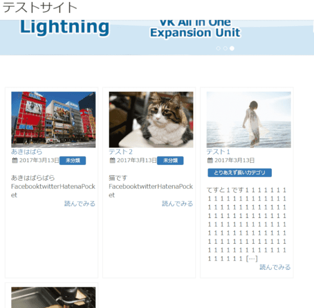
モバイルはリスト型のままとタイル型、二通りのコードを載せています。
事前準備
トップページを固定ページ利用に変更する
トップページ用の固定ページを作成します。
「カスタマイズ」→「固定フロントページ」で設定を変更し、ページを指定します。
固定ページでPHPファイルをインクルードできるようにする
こちらの記事を参考にfuncitons.phpにコードを記述。
子テーマにmyphpfilesフォルダを作っておきます。

html
top.phpという名前でphpファイルを作成します。
次のコードをファイルに記述します。
モバイルの場合はリスト表示する場合
<?php if (!wp_is_mobile()) :?>
<div id="list" class="container-fluid">
<div class="row list-card row-eq-height">
<?php
 $wp_query = new WP_Query();
 $my_posts = array(
 'post_type' => 'post',
 'posts_per_page'=> '12',
 );
 $wp_query->query( $my_posts );
 if( $wp_query->have_posts() ): while( $wp_query->have_posts() ) : $wp_query->the_post();
?>
<div class="toc col-xs-12 col-sm-6 col-lg-4">
<div class="card">
<div class="term"><a href="<?php the_permalink(); ?>"><?php the_post_thumbnail('medium'); ?></a></div>
<div class="entry-title"><a href="<?php the_permalink(); ?>" class="entry-link"><?php the_title(); ?></a></div>
<?php get_template_part('module_loop_post_meta'); ?>
<div class="excetop"><?php echo get_the_excerpt(); ?></div>
<Div class="tuzuki" Align="right"><a href="<?php the_permalink() ?>">続きを読む</a></div>
</div>
</div>
<?php endwhile; endif; wp_reset_postdata(); ?>
</div>
</div>
<?php else:?>
<div id="moblist">
<?php
 $wp_query = new WP_Query();
 $my_posts = array(
 'post_type' => 'post',
 'posts_per_page'=> '10',
 );
 $wp_query->query( $my_posts );
 if( $wp_query->have_posts() ): while( $wp_query->have_posts() ) : $wp_query->the_post(); ?>
<div class="card">
<div class="term mobimg"><a href="<?php the_permalink() ?>"><?php if ( has_post_thumbnail() ): ?>
 <?php the_post_thumbnail( 'thumb100' ,array( 'alt' =>get_the_title())); ?>
 <?php else: ?>
 <img src="<?php echo get_template_directory_uri(); ?>/images/no-img.png" alt="<?php the_title(); ?>" width="100" height="100" />
 <?php endif; ?></div>
<div class="entry-title">
<a href="<?php the_permalink(); ?>"><?php the_title(); ?></a>
<?php
 get_template_part('module_loop_post_meta'); ?>
</div>
</div>
<?php endwhile; endif; wp_reset_postdata(); ?>
</div>
<?php endif; ?>
PCとモバイルで分けない場合
<div id="list" class="container-fluid">
<div class="row list-card row-eq-height">
<?php
 $wp_query = new WP_Query();
 $my_posts = array(
 'post_type' => 'post',
 'posts_per_page'=> '12',
 );
 $wp_query->query( $my_posts );
 if( $wp_query->have_posts() ): while( $wp_query->have_posts() ) : $wp_query->the_post();
?>
<div class="toc col-xs-12 col-sm-6 col-lg-4">
<div class="card">
<div class="term"><a href="<?php the_permalink(); ?>"><?php the_post_thumbnail('medium'); ?></a></div>
<div class="entry-title"><a href="<?php the_permalink(); ?>" class="entry-link"><?php the_title(); ?></a></div>
<?php get_template_part('module_loop_post_meta'); ?>
<div class="excetop"><?php echo get_the_excerpt(); ?></div>
<Div class="tuzuki" Align="right"><a href="<?php the_permalink() ?>">続きを読む</a></div>
</div>
</div>
<?php endwhile; endif; wp_reset_postdata(); ?>
</div>
</div>
レイアウトの調整
パソコンで3列から2列にしたい場合は、次の通り変更してください。
<div class="toc col-xs-12 col-sm-6">
12で指定した数字を割ったものがカラム数となります。
抜粋を表示したくない場合は次の記述を削除してください。
<div class="excetop"><?php echo get_the_excerpt(); ?></div>
CSS
style.cssに次の記述をします。
.row-eq-height {
 display: flex;
 flex-wrap: wrap;
}
.card{
 border: 2px solid #f5f5f5;
 padding:10px 10px 10px 10px ;
 height:100%;
 border-radius: 4px;
}
#list .term{
 border-radius: 4px;
}
#list .list-card{
 margin-top:20px;
}
#list .tuzuki{
 padding-bottom:15px;
 font-size:1.4rem;
}
#list .entry-meta_items{
 padding-right:5px;
 margin-bottom:10px !important;
}
#list .entry-meta{
 display: flex;
 border-top: 1px dotted;
 flex-wrap: wrap;
}
#list .toc{
 padding:5px !important;
}
#list .excetop{
 font-size:1.4rem;
}
#list .entry-title{
 font-size:1.6rem;
 padding:5px 0 5px ;
}
#list .term img{
 max-width:200% !important;
 width:100% ;
 border-radius: 4px;
}
.mobimg{
float:left;
}
.mobimg img{
margin-right:15px !important;
max-width:100px !important;
 border-radius: 4px;
}
モバイルと表示を分けない場合は.mobimgの記述を削除してください。
カードの大きさを高さに合わせたくないときは、次の記述を削除してください。
.card{
 height:100%;
}
完成
top.phpをmyphpfilesにアップします。
固定ページにショートコード[myphp file=’top’]を記載します(半角に変えてください)
まとめ
固定ページに作ったのは、差し替えがすぐにできるのと、色々応用が効くからです。
もちろんindexテンプレートに直接記述してもOK。
どちらにするかは自分の技量と相談してください